
Modern process mining in Snowflake Data Cloud
QPR Software's decision to power its process mining solution with the Snowflake Data Cloud has recently received a warm welcome in the US market. This...


QPR ProcessAnalyzer 2020.3 provides predefined robotic process automation (RPA) charts, statistical calculations and advanced security hardening for process mining. Read more to learn about these new functionalities in order to improve your organization's process mining journey!
RPA Charts speed up any process mining initiative by adding seven predefined charts that can be used as ad-hoc analysis charts or dashboard components in your own RPA solution. All charts are delivered as ChartView presets and they can be further customized by adding your own dimensions, selections and what-if scenario capabilities.
%20using%20QPR%20ProcessAnalyzer%202020.3%20-%20Automation%20Rate%20Trend%20Screenshot.png)
What is your end-to-end automation rate today and is it improving?
Automation Rate Trend shows the progress and results of your RPA and automation efforts as a monthly trend. It is easy to see how automation rate is increasing as a result of RPA activities. However, if the automation is not working fine, then the amount of other manual tasks within the process starts to increase. This is often caused by rework, manual work for fixing events performed by bots and manual work based on customer complaints.
With this report, you get a quick overview of your automation progress within the end-to-end process. QPR ProcessAnalyzer provides visibility to your end-to-end automation rate over time.
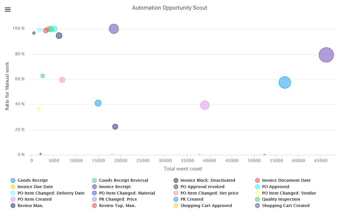
Which tasks should be automated next?
Automation Opportunity Scout is an easy-to-use bubble chart correlating to three main characteristics of event types:
You should look for:
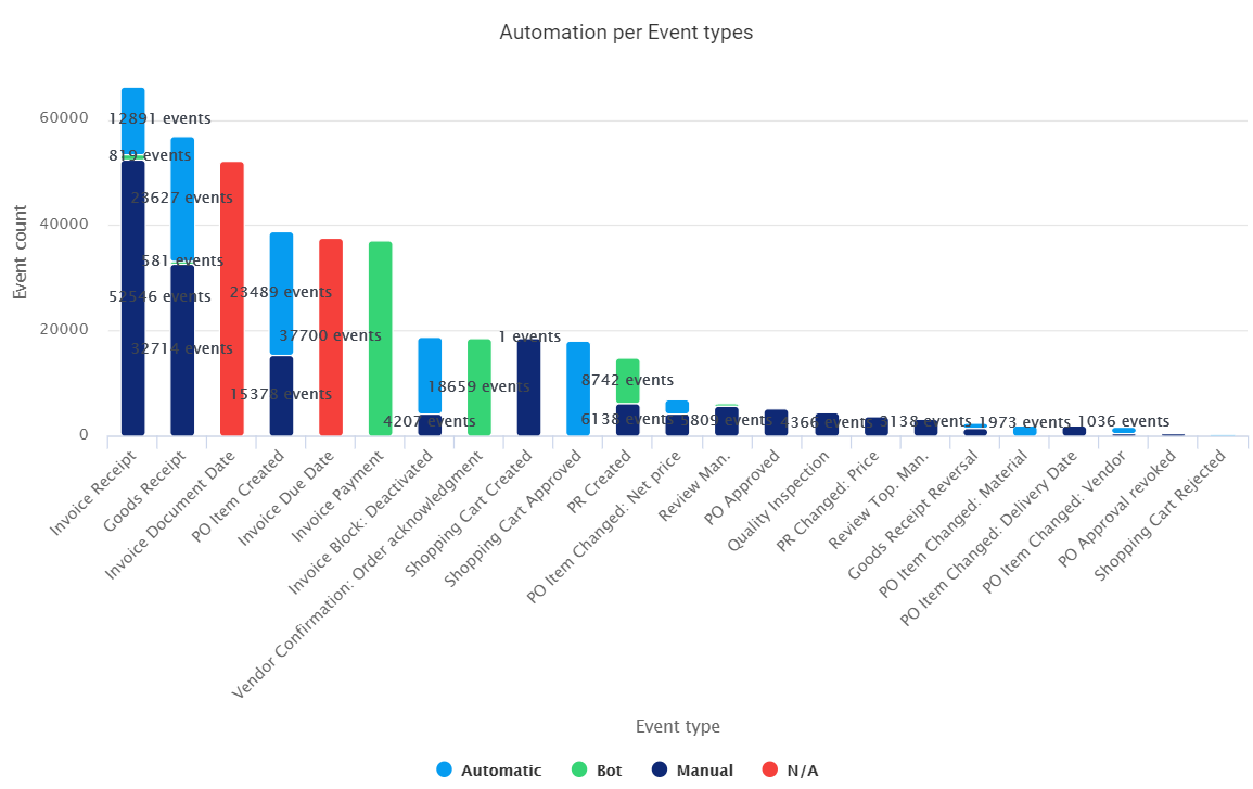
How well you know who does the work in your organization?
Let process mining reveal the details for manual users, bots and system automation for each event type.
Automation per Event Types shows the activities taking place during the end-to-end process execution by the automation property recorded in each event.
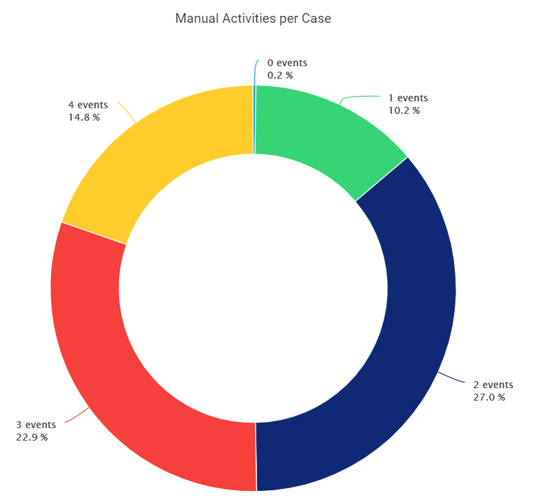
How many times you need to touch the case to score a goal?
Manual Activities per Case is an easy-to-use way of showing the amount of manual activities needed to complete a case. Touchless cases are cases that complete automatically, without any manual activities. Other cases may need one, two, three, or even more manual user activities in order to complete.
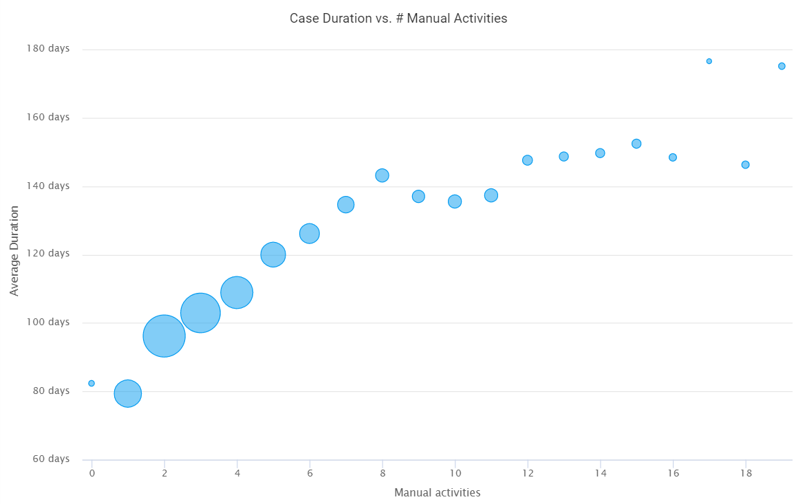
How much faster is the automated process?
Case Duration vs. Manual Activities shows the effect of manual activities on the average case duration. As you see from this picture, the process tends to be faster when the amount of manual activities is smaller.
The size of each bubble is defined by the amount of cases that have the corresponding amount of manual activities - the bigger the bubble, the more cases there are with that amount of activities.
This chart can be used to guide your RPA project by benchmarking successful and fast automated cases in left-low corner with problematic, long-lasting cases in the right-top corner.
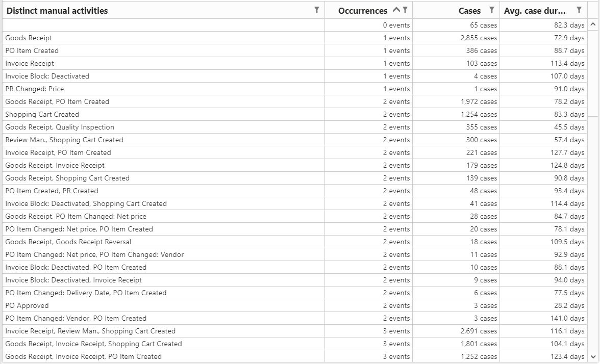
Which manual events cause longest lead times?
Manual Activities Details provides a further drill-down to the manual activity combinations causing the longest lead times. The first row in the detailed report shows the amount of cases with zero manual activities: 65 cases, with an average case duration of 82 days. Third row shows that there are 103 cases with single manual invoice receipt with average case duration of 113 days.
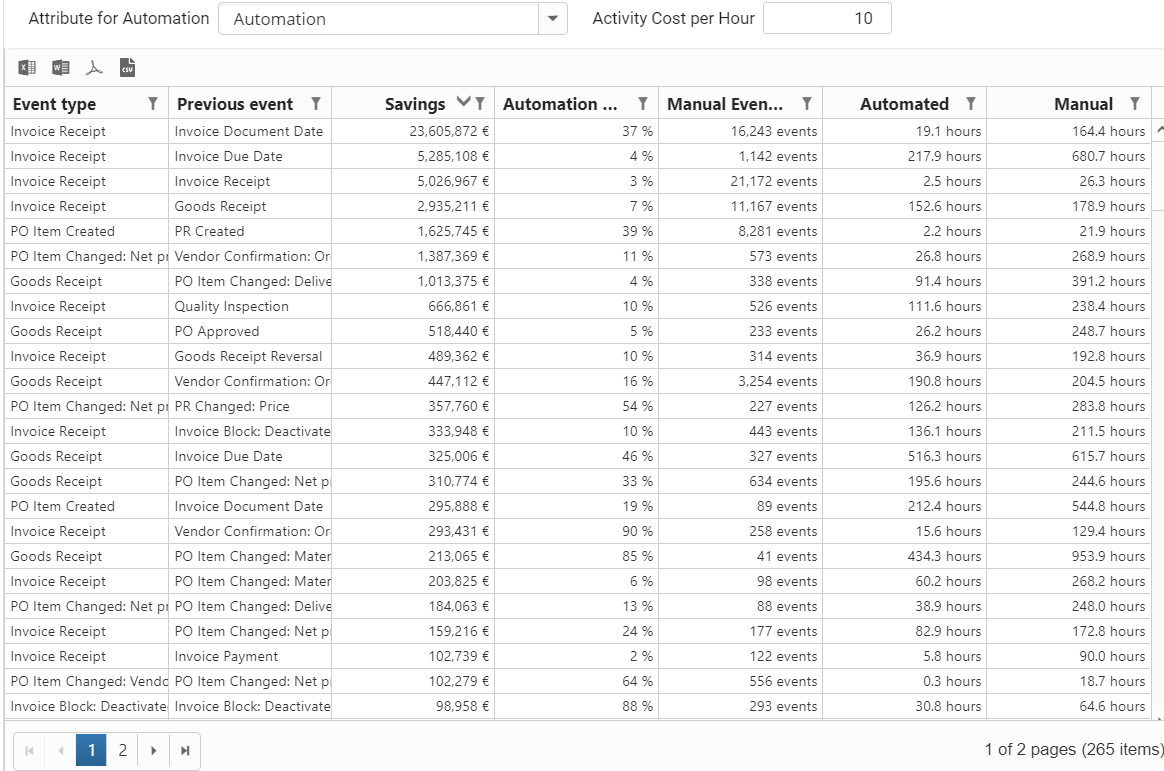
How much time and money can be saved by your next automation project?
Cost Savings by Automation is a detailed report showing the estimated potential for cost savings. The report is generated for each individual flow in the discovered as-is process model. Each flow is then analyzed by comparing the lead time of automated cases against the manual cases. The difference is regarded as the potential savings for the lead time.
By calculating these savings with the total amount of occurrences for that particular flow, we get the estimate for the potential lead time savings in the total flow. Using the given Activity Cost per Hour, this lead-time improvement is further converted into potential savings in currency.
This report serves as a baseline tool for analyzing the automation cost savings potential. It can be fully customized for your organization's details concerning hourly costs for different flows and other what-if scenario options.
Statistical calculations are used to easily add more depth and accuracy into your process mining analyses. More than 10 operations can be applied to any ChartView measure, dimension or column, in order to show cumulative values, moving averages and trend charts with change from the previous value. Operations can also be used for focusing the chart content into relevant finding - by removing outliers such as null values, insignificant values, too small/large values and incorrect historical timestamps and future events.
Available calculations are:
Several statistical calculation operations can be used at the same time. Some calculations also support an additional parameter, that is specified in the Reference value for statistical calculations field.
Sounds great - let's now move to examples!
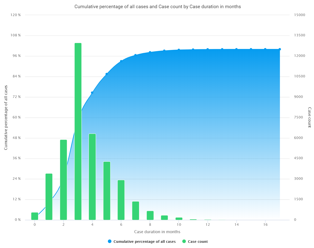
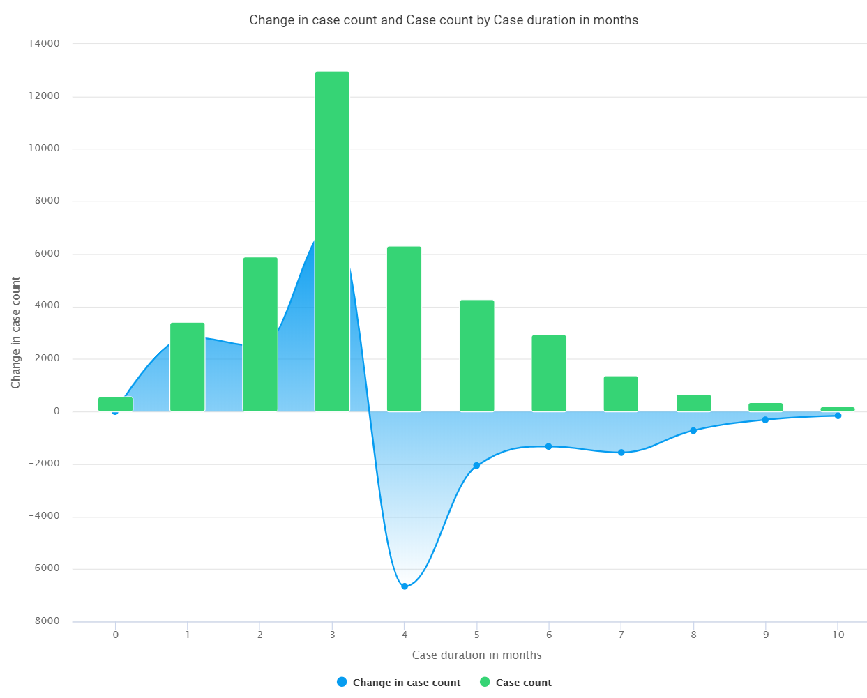
This enhanced duration chart is showing the actual duration histogram, with green column chart bars representing the amounts of cases completed within a given led time.
The second measure - shown as the blue line chart - is the cumulative percentage of cases that are completed within the given duration. The cumulative value curve reaches 100%.
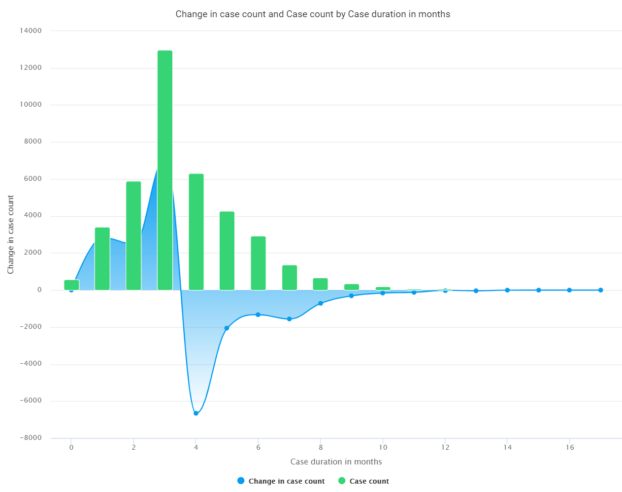
Here, you see the statistical calculations for change in the case count. The duration histogram is same as in the first picture. Now, the spline chart is used to show difference between column bars. The chart on the left shows all values and the chart on the right uses the statistical calculation option "Remove insignificant values from start and end" to filter entries with less than 100 cases - making the chart more readable.
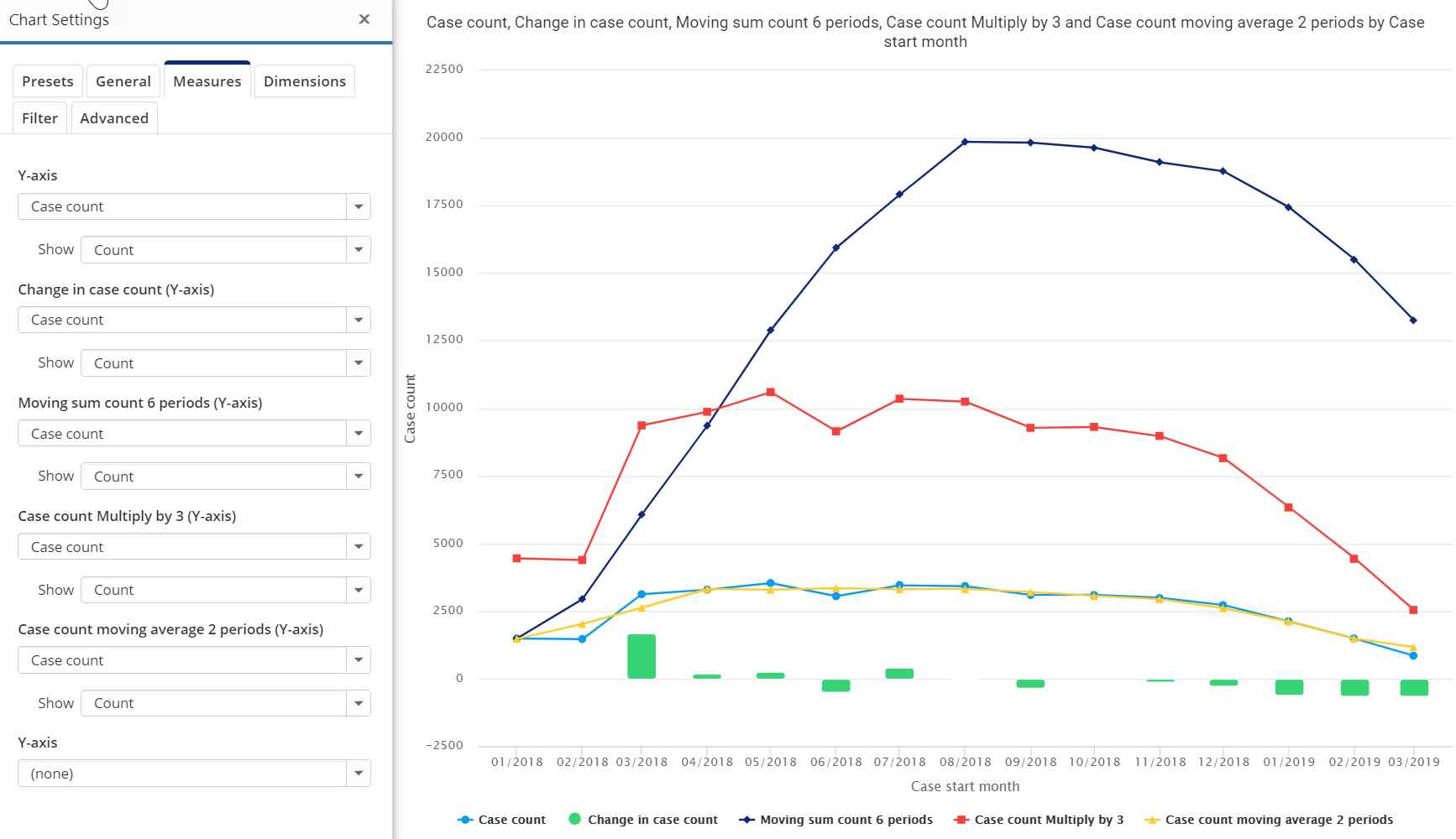
Below is a summary line chart showing five versions of the Case count measure in a trend chart by the dimension "case starting month". The plain case count value is shown as a blue line. The "change in case count" is shown with green column bars. The "moving sum of 6 periods" is the highest reaching black line. The red line shows the case count values multiplied by three. The yellow line chart is the 2-period moving average of the case count.
I encourage you to use the statistical calculations in your process mining analysis to make your results even more relevant and meaningful for business users. Together with the powerful expression language, you can calculate and present any relevant process KPI measure within your charts and dashboards.
QPR ProcessAnalyzer meets the strict security requirements of large enterprise customers both in the QPR Cloud environment as well as for on-premise deployments.
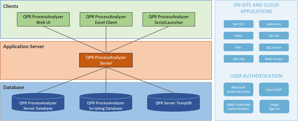
As part of the 2020.3 release, we provide a list of advanced security hardening options, which should be considered when using QPR ProcessAnalyzer on-premise. QPR Cloud environments are configured to use the adequate security options. Read more about system architecture and components in QPR ProcessAnalyzer Wiki.
Advanced security hardening options for QPR ProcessAnalyzer include:
This is the new QPR ProcessAnalyzer 2020.3 😀👍
If you’re already using QPR ProcessAnalyzer, go ahead and try these new features when you get a chance. If not, and if you’re new to Process Mining, read more on this page. If you want to know more about QPR ProcessAnalyzer, go here. Also, don’t hesitate to book a live QPR ProcessAnalyzer demo:
It’s a good time to take a look at Process Mining if your company hasn’t already. The capabilities and usability of Process Mining software are improving rapidly, and the market is quickly becoming mature, though there’s still much work to be done. If you think your company is ready to step it up with the future of as-is process modeling and process efficiency maximization, the fastest way to get things moving is to send our Process Mining team a direct message:

QPR ProcessAnalyzer 2020.3 Release Webinar Recording (30 mins + Q&A)
Download QPR ProcessAnalyzer 2020.3 Release Webinar Presentation Slides here.
Access the See QPR ProcessAnalyzer Release Notes here.

Share Online

QPR Software's decision to power its process mining solution with the Snowflake Data Cloud has recently received a warm welcome in the US market. This...
What would you do if you had a digital replica of your business operations? Imagine being able to peer into every corner of your organization, analyze...

Process mining is critical for businesses that want to optimize their operations, reduce costs, and improve customer satisfaction. However, choosing the best...

Are you considering creating a Digital Twin of an Organization to transform your company into a digital organization? Learn the what, why, and how in this blog...
Featured Blog
Identifying inefficiencies, risks, and automation opportunities with process mining
“With QPR ProcessAnalyzer, we were able to analyze the process in 2-3 hours instead of three weeks“
Read more