

Process Intelligence is critical infrastructure for enterprise AI.
AI can generate answers. Process intelligence enables responsible action.
As enterprise AI evolves from copilots to autonomous agents, success depends on operational context — understanding how work actually flows, what rules apply, and where risks exist.
QPR ProcessAnalyzer provides that missing layer by connecting enterprise data, process reality, and governance into one trusted operational context for AI-driven decisions and actions.

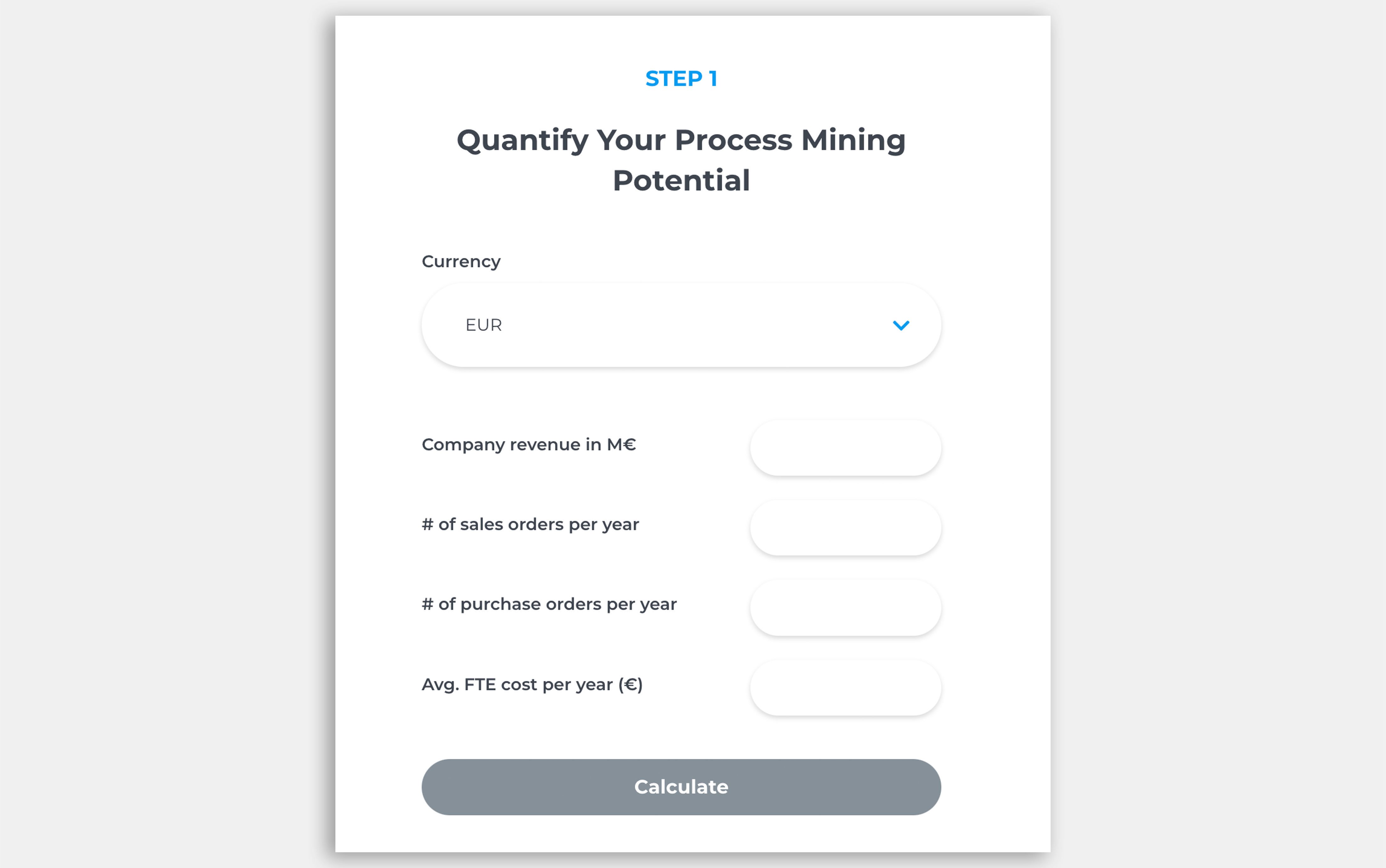
What’s the business impact of AI-ready process intelligence?
Estimate how better process visibility, faster decisions, and AI-powered operational context can improve efficiency and reduce costs.


Process Mining in Banking: How Erste Bank Poland Reduced Loan Drop-Offs and Recovered Millions

Process Mining in Banking: How Erste Bank Poland Reduced Loan Drop-Offs and Recovered Millions
Jun 29, 2026
8
min read
How Sanofi Built an Enterprise Process Mining Center of Excellence with AI and Snowflake
How Sanofi Built an Enterprise Process Mining Center of Excellence with AI and Snowflake
Jun 22, 2026
9
min read
