

Why organizations choose QPR ProcessAnalyzer
Built for the AI era — combining process intelligence, business context, and enterprise-grade execution in one platform.
- AI-ready operational intelligence - Give copilots and AI agents trusted operational context through process mining, business rules, and process knowledge.
- Built for Snowflake – The only process intelligence platform running natively in Snowflake — enabling secure, scalable, real-time analysis where your data already resides.
- Process Mining + Process Modeling – Combine real-world execution data with business logic and BPMN models to enable explainable and governed AI.
- MCP-enabled for AI agents Bring process intelligence directly into ChatGPT, Claude, Copilot, and enterprise AI agents through an open Model Context Protocol (MCP) interface.
- Enterprise-grade performance without platform overhead – Faster deployment, lower total cost of ownership, and customer-friendly operating models.

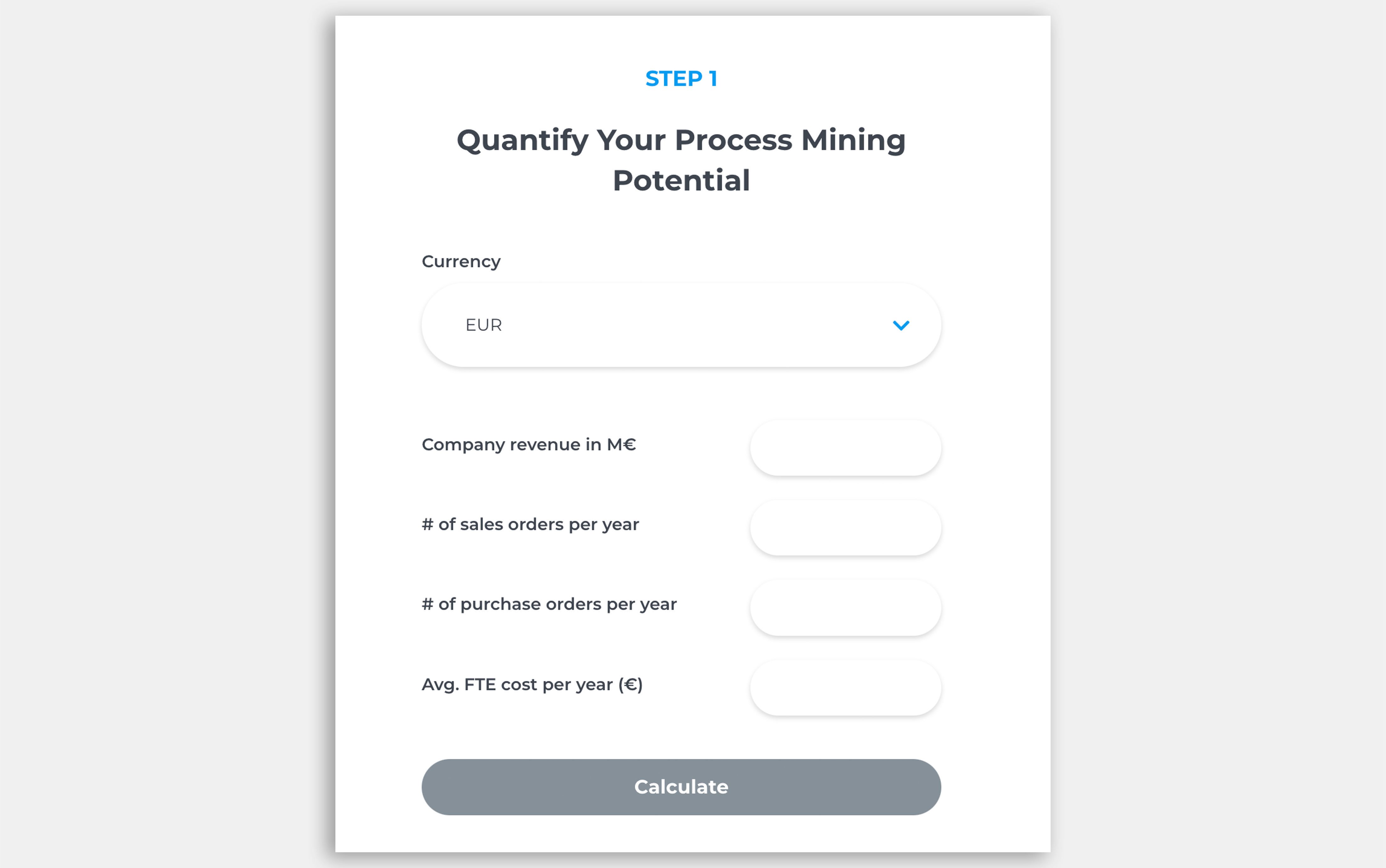
How much can you save with process mining?
Discover the savings potential of process mining in minutes. Our ROI Calculator gives you fast, tailored insights based on your company’s data.


How Process Mining Helped a Global Manufacturer Avoid a €3M ERP Investment

How Process Mining Helped a Global Manufacturer Avoid a €3M ERP Investment
May 1, 2026
4
min read
From Dashboards to AI Agents: How QPR’s MCP Server Brings Process Intelligence Across Your Organization

From Dashboards to AI Agents: How QPR’s MCP Server Brings Process Intelligence Across Your Organization
Apr 30, 2026
6
min read
