
How to choose the right process mining vendor for your business
Process mining is critical for businesses that want to optimize their operations, reduce costs, and improve customer satisfaction. However, choosing the best...

The latest version of QPR ProcessAnalyzer introduces Root Cause Analysis for ChartView, the powerful chart builder. Root Cause Analysis has been one of the key feature-related differentiators of QPR ProcessAnalyzer for the past years. The functionality has now been extended to support ChartView, which is the latest addition to the presentation object library.
ChartView itself has been updated once again with many new features that I’ve listed at the end of this post. These features have to do with advanced configurations that give you more ways to present your process-related findings. If this sounds familiar, it’s likely because in my previous post I covered other advanced features of ChartView. So consider this article partly a sequel. But, let’s start with the extension of Root Cause Analysis.
To get to the point, let’s continue using the chart that I created in my previous post. At one point it looked like this:
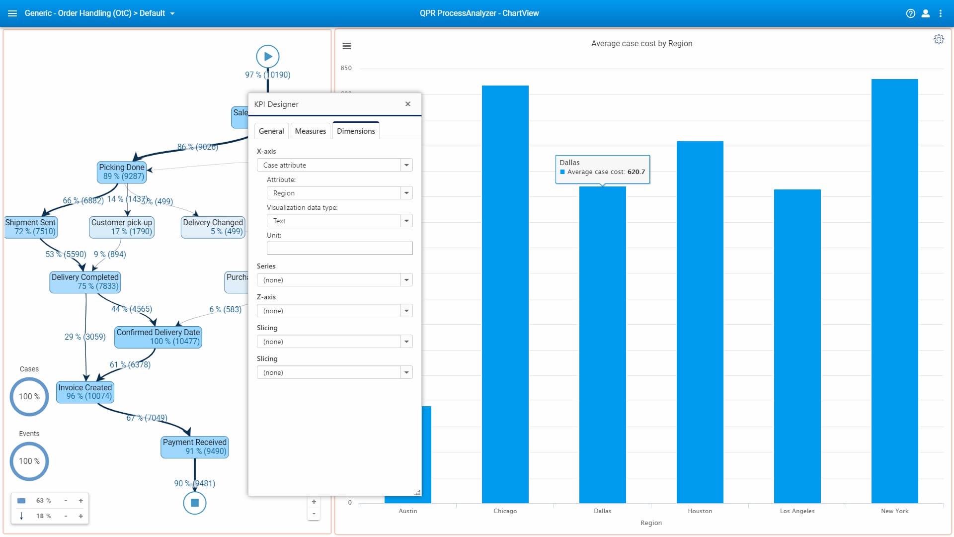
We looked at the average case cost by region. If you change the first measure to be “Case duration” instead of average case cost, you’ll see how long it takes, on average, to complete one case in different cities:
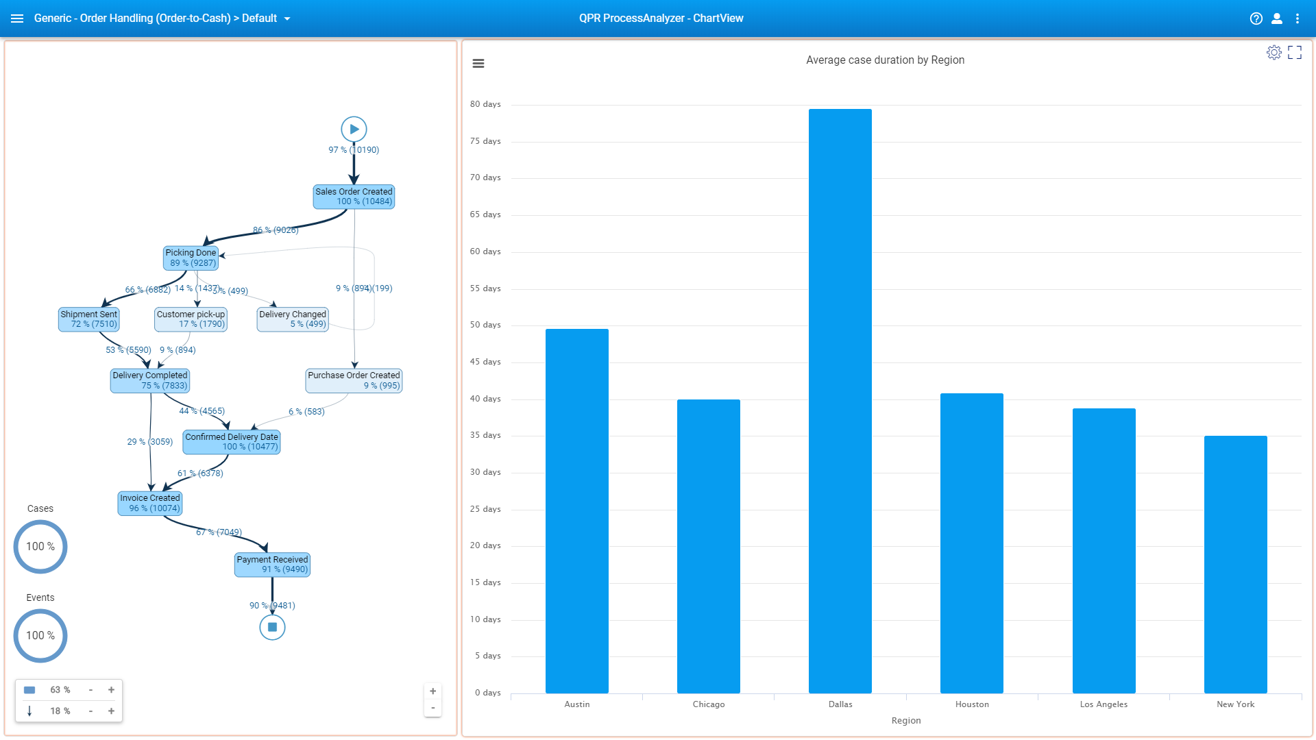
Dallas is clearly an outlier: let’s see why that would be. Clicking the bar that represents Dallas’ average case duration brings up a small menu above the chart:

Click the “Show root causes for the selection” button. Notice how the flowchart on the left-hand side changes such that different shades of red are applied to those event types through which “Dallas cases (process instances)” diverge the most from other cases.
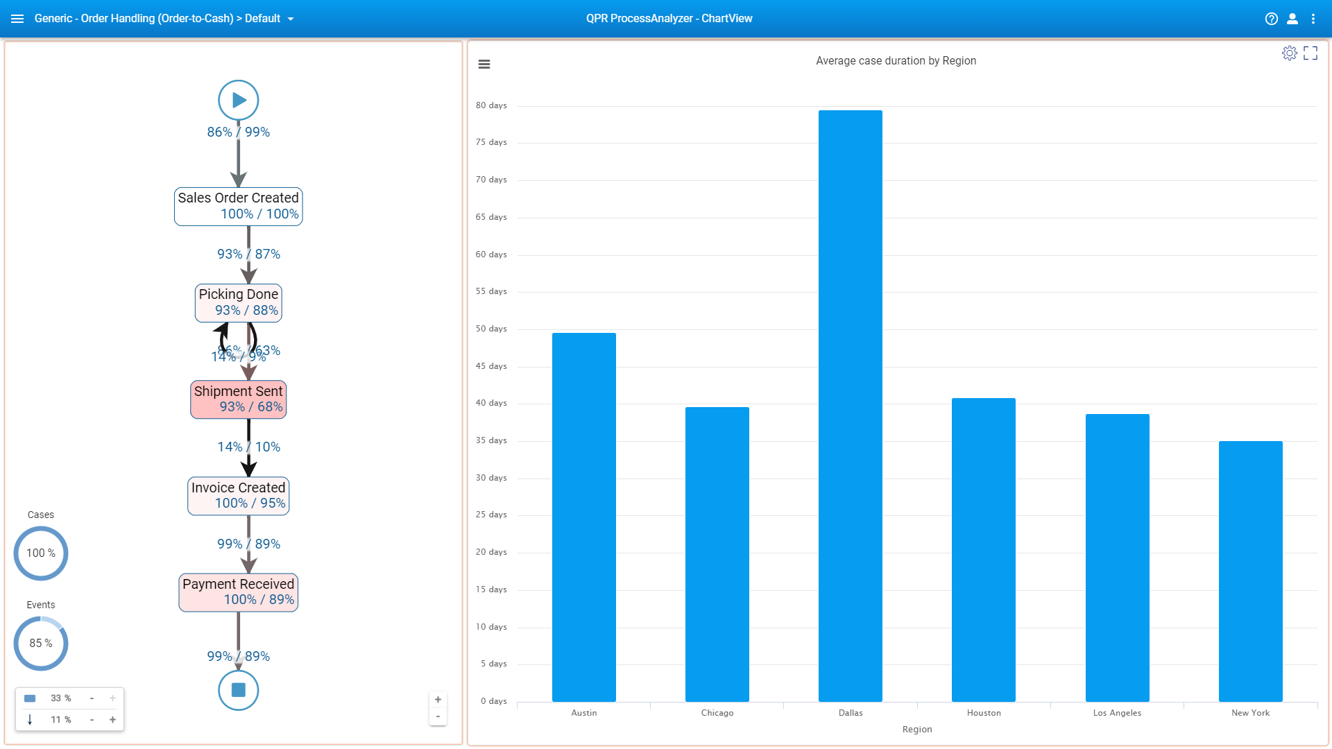
For example, the “Shipment Sent” event type shows 93% / 68% under the label. This means that 93% of all Dallas cases go through the Shipment Sent event type as opposed to 68% for non-Dallas cases. Let’s dive a little deeper and have the flowchart show durations for all flows (right-click the flowchart background, click Settings, go to the Settings tab at the top right of the sliding window that opened, and finally click “Show on Flows” under “Duration KPIs”):
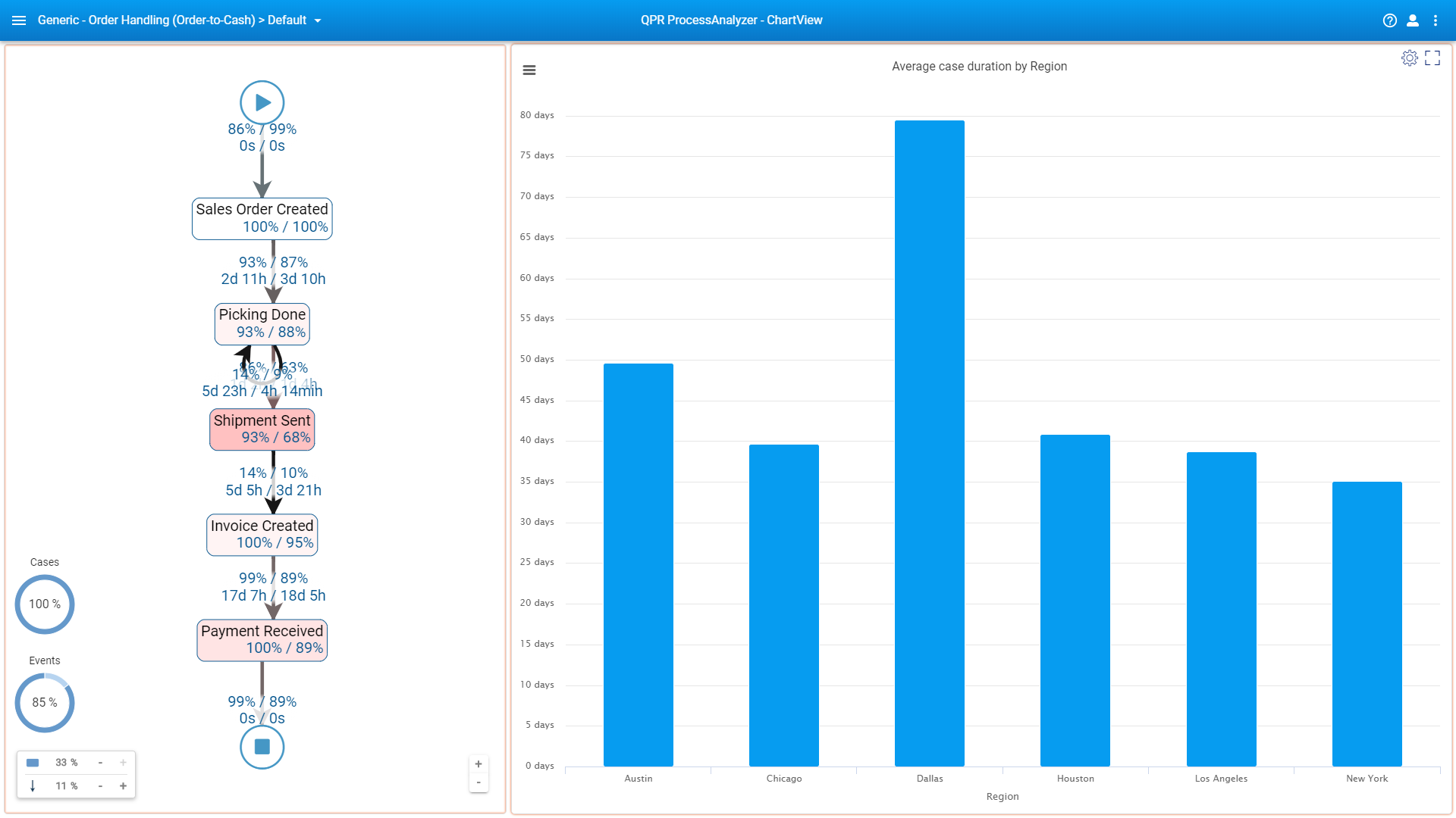
On top of the flow from Shipment Sent to Invoice Created it says “5d 5h / 3d 21h”. Looks like Dallas has got some issues with on-time invoicing: It takes nearly two days longer to create invoices in Dallas than the rest of the cities on average.
So what’s the big deal here? It’s that you’ll now have Root Cause Analysis functionality available for not just OOTB views but also for any custom views. This opens up many more options for presenting cause-effect relationships.
Speaking of presenting, charts that are built with ChartView can now be viewed in full-screen presentation mode.
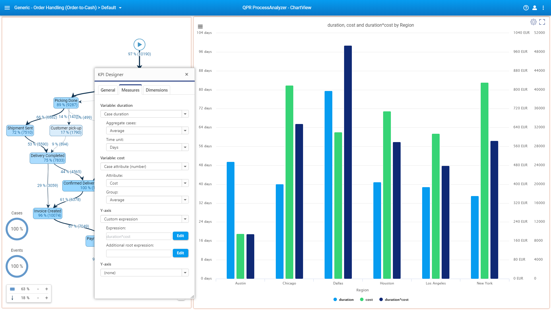
Continuing with the same model, suppose your manager asked you to calculate the cost per duration for each case. How would you go about it?
The measures and dimensions defined in ChartView’s KPI Designer now include an advanced settings icon that is visible when you hover over the area dedicated to a single measure or dimension.
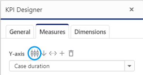
Clicking the indicated icon will open up a pop-up window that is almost similar for both measures and dimensions (the last drop-down and the checkbox are extras in the measures dialog):
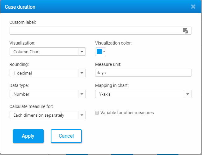
As you can see, most of the options are straightforward: customize your chart title (or more accurately, part of the autogenerated title), choose a chart type for each measure, define rounding, color, data type, and unit for the measure. It’s the last checkbox that might need more explaining, but that’s exactly what we’ll need to deliver on your manager’s request.
If you check the box and give the measure a custom label, this label will act as the name of a variable that represents the underlying measure. So, continuing from the above example, try adding a new measure for case cost such that the KPI Designer’s Measures tab will look like this:
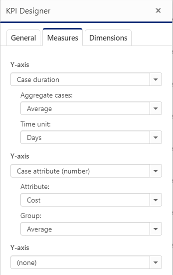
Then, in each measure’s advanced settings, check “Variable for other measures”, and select “(Not used)” under “Mapping in chart”. Remember to also give custom labels for both. The custom labels will act as variables that you can refer to locally from within the ChartView component. Here I’ll just use “Duration” and “Cost” as the variable names. Doing this will enable you to define new measures based on the defined variables using custom expressions (see my previous blog to understand how to work with custom expressions), like this:
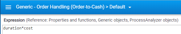
And this is what you’ll get:

Whether "duration * cost" makes sense is debatable, but you see that new measures can be built with previously defined measures and there's no limit to the number of such constructs.
Besides the above-explained calculated measures, dashboarding improvements include:
I think there’s enough here to digest for the next six weeks. If you’re already using QPR ProcessAnalyzer, go ahead and try these new features out when you get a chance. If not, and if you’re new to Process Mining, read more on this page. If you want to know more about QPR ProcessAnalyzer, go here. Also, don’t hesitate to book a live QPR ProcessAnalyzer demo:
It’s a good time to take a look at Process Mining if your company hasn’t already. Capabilities and usability of Process Mining software are improving rapidly and the market is quickly becoming mature, though there’s still much work to be done. If you think your company is ready to step it up with the future of as-is process modeling and process efficiency maximization, the fastest way to get things moving is to send our Process Mining team a direct message:


Share Online

Process mining is critical for businesses that want to optimize their operations, reduce costs, and improve customer satisfaction. However, choosing the best...

Are you considering creating a Digital Twin of an Organization to transform your company into a digital organization? Learn the what, why, and how in this blog...

The importance of a company's data strategy in relation to its process mining decisions cannot be overstated.
In today's challenging business landscape, efficiency is the key to staying competitive. At QPR, we're constantly evolving to meet the dynamic needs of our...
Featured Blog
Identifying inefficiencies, risks, and automation opportunities with process mining
“With QPR ProcessAnalyzer, we were able to analyze the process in 2-3 hours instead of three weeks“
Read more